Recommended tools
Software deals worth checking before you buy full price.
Browse AppSumo for founder tools, AI apps, and workflow software deals that can save real money.
Affiliate link. If you buy through it, this site may earn a commission at no extra cost to you.
⏱ 28 min read
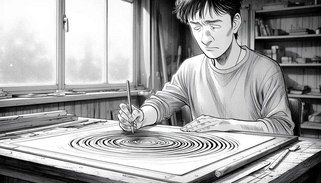
You don’t need a degree in systems engineering to draw a decent process map, but you do need to stop fighting the software. Most people start drawing a flowchart in Visio and immediately regret it. They try to freehand shapes, they get lost in a sea of disconnected lines, and within ten minutes, their screen looks like a tangled mess of spaghetti that even they can’t untangle. That is exactly why I am writing this: to show you how to create a flowchart in Visio without losing your mind.
Visio is powerful, but it is notoriously unforgiving if you treat it like a piece of paper and a pen. It wants structure. It wants grid alignment. It wants logic. If you ignore those rules, you aren’t designing a diagram; you are creating digital chaos. The good news is that the chaos is entirely avoidable once you understand the tools that actually matter. We aren’t going to talk about the history of flowcharts or the theoretical benefits of BPMN. We are going to talk about the specific clicks, drags, and snaps that keep your sanity intact.
The first rule of survival in Visio is to never, ever try to draw the boxes yourself. The temptation to grab a rectangle tool and trace a box around a word is strong, but it is a path to disaster. You will end up with uneven borders, wonky angles, and shapes that refuse to resize predictably. Instead, you must use the pre-defined stencils. These are the building blocks Microsoft has spent decades perfecting. They handle the resizing, the font wrapping, and the internal alignment automatically. When you drag a “Decision” shape from the stencil onto your page, it comes with a built-in logic engine. It expects a “Yes” path and a “No” path. It expects to connect to something else. By sticking to these standard shapes, you ensure that your diagram remains editable later. If you hand-draw a shape, you are locking yourself into a static image that becomes impossible to update when the process changes. Use the stencils. It is the single fastest way to keep your project organized.
Once you have your shapes on the canvas, the real nightmare begins for many people: the connectors. This is where most Visio users go from “confused” to “frustrated.” You drag a line from one box to another, you try to adjust the bend, and suddenly the line snaps to a weird angle or disconnects entirely. This happens because Visio uses a snapping system that feels like it is fighting you until you understand the rules. The lines are not just drawn; they are magnetic. When you hover near the middle of a shape’s edge, a small circle appears. That is the connection point. If you do not click exactly on that circle, Visio may draw a line that looks connected but is actually floating in space. This floating line will break when you move the shape, leaving you with a broken diagram and a headache.
To master the connection, you must learn the difference between the “AutoConnect” setting and the “Smart Guide.” AutoConnect is a global setting that automatically tries to attach your line to a shape when you drag. It is useful for quick sketches, but it often attaches to the wrong side or creates messy crossings. For a professional flowchart, you should generally turn AutoConnect off for the specific page you are working on. This forces you to be deliberate. You click the start point (the circle), you drag to the end point (the circle), and Visio snaps perfectly. If you need to route a line around a complex obstacle, you don’t just drag wildly. You click the line to select it, and you will see small handles appear along the path. Drag those handles to create elbows and curves. This gives you precise control over the routing without breaking the connection. Treat the lines as structural beams, not scribbles. Precision here saves hours of rework later.
Another common pitfall is the sheer number of floating shapes. When you start a new diagram, your page is blank. You drag a shape in, then another, then another. Soon, you have a row of boxes and you have to manually push them together. Visio has a feature called “Snap to Grid,” and while it sounds mundane, it is your best friend. When Snap to Grid is active, every shape you draw or move will align with the invisible grid underneath. This prevents the “drift” where shapes slowly slide out of alignment as you tweak them. If your shapes are not on the grid, they will never look professional. You can adjust the grid size in the layout settings, but for flowcharts, a standard grid is usually fine. The key is to ensure it is turned on. It acts as a silent partner, constantly nudging your shapes into place so they look intentional rather than accidental.
Formatting is often where the visual polish gets lost. People spend hours tweaking line colors and font sizes, only to realize the hierarchy is wrong. A flowchart is a logical document, not an art piece. The logic dictates the visual style. If a step is a major milestone, it should be a different shape or color than a minor decision. However, do not overuse colors. A rainbow of boxes in a single process makes it hard to read. Stick to a strict palette. Use one color for the main process flow, a different one for decisions, and perhaps a distinct color for external inputs or outputs. Consistency is key. If every “Yes” branch looks different from every other “Yes” branch, your user will have to pause and figure out why. Your diagram should speak for itself. The visual cues should reinforce the logic, not distract from it. Keep the lines uniform, the fonts consistent, and the spacing regular. This visual discipline is what separates a readable chart from a confusing mess.
Finally, remember that a flowchart is a living document. Processes change. Customers change their minds. The requirements shift. If your chart is a static image, you will eventually have to redraw it from scratch. If it is a Visio diagram, you can update it. But updates only work if the underlying structure is sound. The shapes must connect correctly. The logic must follow the standard. The lines must snap. If you build it right the first time, updating it is a matter of moving a few boxes and rerouting a couple of lines. If you build it wrong, you are stuck with a digital brick wall. The effort you put into learning these specific Visio mechanics—the stencils, the snapping, the grid—is an investment in your future self. You will thank yourself when you need to explain a process to a stakeholder and the diagram actually holds together.
By following these principles, you transform the task from a chore into a manageable workflow. You stop fighting the software and start using it as a tool for clarity. The frustration evaporates when you realize that the software is doing the heavy lifting for you, provided you give it the structure it needs. This is the essence of how to create a flowchart in Visio without losing your mind: respect the tools, respect the logic, and let the grid do the work.
The Stencil Strategy: Stop Drawing, Start Dragging
The most immediate source of frustration in Visio is the belief that you need to draw the shapes. This is a fundamental misunderstanding of the software’s workflow. The stencils are not just a collection of clipart; they are intelligent objects that contain specific properties. When you drag a “Terminator” shape onto the page, it knows it is a start or end point. When you drag a “Process” shape, it knows it requires a verb. When you drag a “Decision” diamond, it knows it requires two outgoing paths. These properties are what allow Visio to organize your diagram logically.
If you try to create your own rectangle and label it “Start,” you have stripped the object of its intelligence. You have created a generic box. If you later decide to add a different process step, your custom box will not know how to align with the standard flow. The stencil shapes are standardized across the industry. They follow the same conventions used in engineering, IT, and business analysis. Using them ensures that anyone who picks up your file understands the symbols immediately. A diamond always means a decision. A parallelogram always means input or output. A rectangle always means a process.
There is a specific workflow for adding shapes that preserves this intelligence. First, locate the “Flowchart” stencil in the Shapes panel. It is usually the first tab on the left. If you don’t see it, you can right-click the shapes tab and select “Add Shapes” to ensure it is loaded. Once you have the stencil open, hover over the shape you need. You will see the cursor change. Click and drag the shape onto your drawing page. Notice that as you drag, the shape might snap to the grid. This is normal. If the shape lands in a position where it looks off, do not worry. You can move it freely. The key is that once it is on the page, it retains all its internal formatting. The text inside is centered. The border is uniform. The font is legible. You do not need to worry about these details anymore.
A common mistake is to resize the stencil shape directly on the page by dragging the corners. While this works, it is better to adjust the text inside the shape to fit the content. If the text is too long, use the “Text Fit” options in the shape’s formatting pane. There is a setting called “Fit text to shape.” This automatically adjusts the font size to ensure the entire process name is visible without overflowing. If you manually drag the corners to make the box bigger, you often end up with a box that is too wide or too tall, breaking the visual rhythm of your chart. Let the shape dictate its size based on the content it holds. This keeps the diagram clean and professional.
Another critical aspect of the stencil strategy is the use of “Smart Guides.” These are the faint colored lines that appear when you move a shape near another shape. They are your visual guide to alignment. If you want two boxes to be perfectly aligned horizontally, move them until the blue guide line appears. Snap to it. This ensures that your rows of boxes are perfectly straight. Without smart guides, you will have to manually measure the distance between boxes to ensure they align. With smart guides, Visio does the measuring for you. It is an invisible safety net that prevents misalignment before it happens.
Consider the scenario where you are building a complex process with many sub-steps. You might have a “Process” box that contains three distinct actions. If you draw a custom box for this, you have to manually center the text and ensure it doesn’t look cramped. If you use the standard “Process” shape from the stencil, you can right-click the shape, select “Format Shape,” and go to the “Layout” tab. Here, you can adjust the spacing between the text and the border, or change the font style. Because it is a standard shape, these settings apply consistently. You can create a style guide for your diagram by setting the font and color for one shape, and then applying that style to others. This is much faster than formatting each box individually. The stencil strategy is about leveraging the built-in capabilities of Visio to maintain consistency and reduce manual effort.
By adopting this approach, you shift your focus from the mechanics of drawing to the logic of the process. You spend less time fighting the software and more time thinking about the workflow. This is the first step in how to create a flowchart in Visio without losing your mind. You stop being an artist and start being an engineer. You use the tools designed for the job, and the job becomes much easier.
Mastering the Connection Points: The Art of the Snap
The second biggest source of anxiety in Visio is the connection lines. You drag a line from one shape to another, and it looks fine. You move the shape, and the line breaks. You try to fix it, and you end up with a tangled web of lines that cross over each other in chaotic ways. This happens because you are not connecting to the correct points. Visio does not connect shapes arbitrarily. It connects them at specific “connection points.” These are small circles that appear on the edges of the shapes. To create a robust flowchart, you must learn to see and use these points.
When you hover your mouse over the edge of a shape in Visio, a small circle will appear. This is the connection point. If you click anywhere else on the edge, you are just drawing a line that might look connected but is not. This “fake connection” is the enemy of a clean diagram. A fake connection will detach when you move the shape. A real connection will stretch and move with the shape. To ensure you are using a real connection, you must click directly on the circle. If you are having trouble seeing the circle, zoom in. Sometimes the circle is small and easy to miss, especially on high-resolution screens. Zooming in gives you a clearer view of the connection points and ensures you are clicking precisely.
There are two main types of connections in Visio: direct connections and routed connections. A direct connection is the simplest. You click the start point, drag to the end point, and release. Visio draws a straight line. If the line needs to go around something, you can hold down the Shift key while dragging to force a straight line. This is useful for long distances where you don’t want any bends. However, most flowcharts require curved lines to navigate around other shapes. This is where the “Smart Guide” comes into play. When you start dragging a line, if you move your mouse away from a direct path, a faint blue guide line will appear. This guide shows you the path that the line will take. If you release the mouse button while the guide is active, the line will follow that path. You can continue dragging to extend the line, or release to finalize it. The guide ensures that the line follows the grid and avoids intersections.
A common mistake is to create a line, then try to adjust it by dragging the line itself. While you can drag a line to move it, it is better to use the “Edit Points” feature. Select the line, and you will see small handles appear along the path. These handles allow you to adjust the curvature of the line. You can drag a handle to create an elbow or a curve. This gives you precise control over the shape of the line. If you need to add a bend to a line that is already drawn, you don’t have to start over. You can edit the line’s path. This is much more efficient than deleting and redrawing the entire line.
Another important feature is the “AutoConnect” setting. This setting automatically attaches a line to a shape when you drag it near the connection points. It is useful for quick sketches, but it can be unpredictable. AutoConnect might attach the line to the wrong side of the shape, or it might create a messy crossing. For a professional diagram, it is often better to turn AutoConnect off. This forces you to be deliberate about where the line goes. You decide the start and end points. You control the path. This level of control prevents the accidental messes that AutoConnect can cause. If you do use AutoConnect, you should test it on a simple diagram first to understand its behavior. Once you know how it works, you can use it to speed up your workflow. But for most complex diagrams, manual control is safer.
The “Smart Guide” is your best friend when it comes to routing lines. It helps you navigate around other shapes and keep the lines clean. When you are dragging a line, the guide will show you the available paths. If you want to avoid a crossing, the guide will show you a route that goes around the obstacle. You can follow the guide to create a clean path. This is much better than trying to guess where the line should go. The guide ensures that the line is aligned with the grid and follows the natural flow of the diagram. It is a visual aid that helps you create a professional-looking chart.
Consider the scenario where you have a decision diamond with multiple branches. You need to connect the “Yes” branch to one process and the “No” branch to another. If you connect these lines incorrectly, the diagram becomes confusing. To avoid this, label your lines. Visio allows you to add text labels to the lines. You can type “Yes” or “No” directly on the line. This makes the diagram self-explanatory. Even if the reader cannot trace the path visually, the text tells them where to go. This is a crucial step in how to create a flowchart in Visio without losing your mind. Clear labeling prevents ambiguity and reduces the cognitive load on the reader.
When you are connecting lines, always check the endpoints. Zoom in to ensure that the lines are actually connected to the shapes. If the line is not connected, it will break when you move the shape. This is a common error that leads to frustration. If you find a broken connection, you can right-click the line and select “Connect to Shape.” This will reattach the line to the nearest connection point. However, it is better to prevent the error in the first place by clicking the correct point initially. Precision in connection creates precision in the final diagram.
The connection points are the backbone of your flowchart. They ensure that the diagram remains intact as you edit it. By mastering the use of these points, you gain control over the layout and the logic of your chart. You stop worrying about lines breaking and start focusing on the content. This is the second step in how to create a flowchart in Visio without losing your mind. You treat the connections as a structural element of the diagram, not just a visual decoration. With practice, connecting lines becomes a muscle memory task. You click, you drag, you snap. It is fast, it is accurate, and it is satisfying.
Organizing Logic: Grids, Layers, and Visual Hierarchy
Once you have your shapes and your lines, the challenge shifts from mechanics to organization. A flowchart can easily become cluttered. Shapes can overlap, lines can cross in confusing ways, and the logic can get lost in the visual noise. To maintain clarity, you must use the organizational tools Visio provides. The grid, layers, and grouping features are essential for keeping your diagram structured and readable. Without them, your chart will look like a chaotic mess, and your readers will struggle to follow the logic.
The grid is the foundation of a clean layout. When you enable the grid, every shape and line aligns to a predefined spacing. This prevents the “drift” where shapes slowly slide out of alignment as you tweak them. To turn on the grid, go to the “View” tab and check “Gridlines.” You can also adjust the spacing in the “Layout” tab. For flowcharts, a grid spacing of 0.5 inches or 1 inch is usually sufficient. This provides enough room for shapes to move without becoming too crowded. The grid acts as a silent partner, constantly nudging your shapes into place. It ensures that your rows of boxes are perfectly straight and your columns are evenly spaced. This visual consistency is crucial for readability. When the layout is predictable, the reader can scan the chart quickly and understand the flow.
Layers are another powerful tool for organization. Visio allows you to group shapes into layers. This is useful when you have multiple processes running in parallel or when you want to show sub-processes within a larger diagram. You can place related shapes on the same layer, and then group them together. This keeps the related elements close together and separates them from other parts of the chart. Layers also help with formatting. You can apply a specific style to a layer, and all shapes on that layer will inherit the style. This is much faster than formatting each shape individually. For example, you might have a “Main Process” layer and a “Sub-Process” layer. The main process shapes can be large and bold, while the sub-process shapes can be smaller and lighter. This visual distinction helps the reader understand the hierarchy of the process.
Grouping is a specific type of layer organization. When you select multiple shapes and press Ctrl+G, they are grouped together. This treats them as a single unit. You can move the group, resize the group, and format the group as a whole. This is useful for creating complex sections of a chart. For example, you might group a series of decision diamonds and their corresponding processes into a single “Evaluation” block. This keeps the related elements together and makes the chart easier to read. Grouping also helps with alignment. When you align a group to another shape, all the shapes in the group move together. This ensures that the internal spacing remains consistent. However, be careful not to over-group. If you group too many unrelated shapes, you lose the ability to edit them individually. Grouping should be used to create logical sections, not to hide complexity.
Visual hierarchy is the final piece of the puzzle. A flowchart is a logical document, and the logic must be visually apparent. Use size, color, and font weight to emphasize important steps. Major milestones should be larger and bolder than minor steps. Key decisions should be highlighted with a distinct color or border. This guides the reader’s eye to the most important parts of the chart. However, do not overuse these techniques. Too many colors and sizes will create a chaotic visual. Stick to a strict palette and consistent sizing rules. Use one color for the main process flow, a different one for decisions, and perhaps a distinct color for external inputs or outputs. This visual discipline is what separates a readable chart from a confusing mess. The visual cues should reinforce the logic, not distract from it.
Consider the scenario where you have a complex process with many branches. Without organization, the chart will look like a tangled web. By using the grid, layers, and grouping, you can create a structured layout that is easy to follow. Group related steps together. Align them to the grid. Use color to distinguish different types of steps. This organization makes the chart readable and professional. It transforms a chaotic mess into a clear map. This is the third step in how to create a flowchart in Visio without losing your mind. You stop fighting the visual clutter and start using the tools to create order. The result is a chart that communicates clearly and effectively.
Troubleshooting Common Pain Points and Edge Cases
Even with the best intentions, you will encounter problems. Visio is a complex tool, and it has quirks that can trip up even experienced users. Understanding these common pain points and how to resolve them is essential for maintaining your sanity. When you hit a snag, knowing the solution prevents frustration from turning into rage. Here are some of the most common issues and how to handle them.
One frequent problem is the “floating line.” This happens when you connect two shapes, but the line does not actually attach to the connection points. When you move a shape, the line breaks or detaches. This is usually caused by clicking slightly off the connection point. To fix this, select the line and check the endpoints. If the endpoint is not on the shape, you can right-click the line and select “Connect to Shape.” This will reattach the line to the nearest connection point. To prevent this in the future, always zoom in when connecting lines. Make sure you are clicking directly on the small circle. Precision is key. Another cause of floating lines is the “AutoConnect” setting. If AutoConnect is on, it might attach the line to the wrong shape. Turning AutoConnect off and manually connecting the lines is often the safest bet.
Another common issue is the “broken grid.” Sometimes, after moving shapes around, they end up slightly off the grid. This can happen if you drag them manually without snapping. To fix this, go to the “View” tab and ensure “Snap to Grid” is enabled. Then, select the misaligned shapes and drag them to the nearest grid line. Visio will snap them into place. This restores the alignment and ensures the chart looks professional. If the grid is too coarse, you can adjust the spacing in the “Layout” tab. A finer grid helps with precise alignment, while a coarser grid is better for larger diagrams.
Text wrapping is another source of frustration. If you have a long process name, it might overflow the shape. To fix this, select the shape and go to the “Format Shape” pane. In the “Layout” tab, choose “Fit text to shape.” This automatically adjusts the font size to fit the content. If you want more control, you can manually adjust the font size and the spacing. Another option is to split the long name into two lines within the shape. Visio allows you to add line breaks within the text. This keeps the shape compact and readable. Avoid using external text boxes for long labels. They do not connect to the shape and can cause alignment issues. Keep the text inside the shape.
Routing lines around obstacles can be tricky. If you need to route a line around a complex shape, the default straight line might not work. To fix this, select the line and use the “Edit Points” feature. Drag the handles to create elbows and curves. This allows you to navigate around obstacles while maintaining a clean path. If the line is still messy, you can try the “Smart Guide.” The guide will show you the available paths and help you create a clean route. Another option is to use a “Connector” shape instead of a line. Connectors are designed to route around obstacles and can be more flexible than standard lines. However, they are more complex to edit, so use them only when necessary.
Finally, the “messy legend” is a common problem. If you have many shapes with different styles, the legend can become cluttered. To fix this, group the shapes by style and create a single legend entry for each group. This reduces the number of entries in the legend and makes it easier to read. You can also hide the legend if it is not needed. Many flowcharts do not require a legend if the shapes are self-explanatory. If you do need a legend, keep it simple and concise. Use clear labels and consistent formatting. This ensures that the legend adds value without cluttering the diagram.
By anticipating these problems and knowing how to solve them, you can work more efficiently and with less stress. These troubleshooting tips are part of how to create a flowchart in Visio without losing your mind. They turn potential roadblocks into minor hurdles that you can easily overcome. With practice, you will develop a mental model of how Visio behaves, and you will be able to predict and prevent most issues before they arise. This confidence is the key to a smooth workflow.
Comparison of Connection Methods
| Method | Best For | Pros | Cons | Risk Level |
|---|---|---|---|---|
| Direct Connect | Simple, linear flows | Fast, intuitive, easy to edit | Can be messy on complex pages | Low |
| Smart Guide | Complex routing | Precise control, avoids crossings | Requires understanding the guide | Medium |
| AutoConnect | Quick sketches | Extremely fast, automatic | Unpredictable, can attach to wrong points | High |
| Connector Shapes | Highly complex layouts | Flexible, routes around obstacles | Harder to edit, heavier file size | Medium |
| Manual Routing | Custom designs | Full creative control | Time-consuming, prone to errors | High |
Decision Matrix for Layout Strategy
| Scenario | Recommended Strategy | Reasoning | Expected Outcome |
|---|---|---|---|
| Simple Linear Process | Direct Connect + Grid | Minimal complexity, fast execution | Clean, straight lines, easy to read |
| Complex Branching Logic | Smart Guide + Grouping | Handles multiple paths, keeps related items together | Organized, logical flow, easy to follow |
| Multi-Level Hierarchy | Layers + Visual Hierarchy | Separates main vs. sub-processes clearly | Distinct visual levels, clear structure |
| External Input/Output | Color Coding + Terminators | Highlights external factors clearly | Immediate visual distinction, clear boundaries |
Precision in connection creates precision in the final diagram.
Visual discipline separates a readable chart from a confusing mess.
Use this mistake-pattern table as a second pass:
| Common mistake | Better move |
|---|---|
| Treating How to Create a Flowchart in Visio Without Losing Your Mind like a universal fix | Define the exact decision or workflow in the work that it should improve first. |
| Copying generic advice | Adjust the approach to your team, data quality, and operating constraints before you standardize it. |
| Chasing completeness too early | Ship one practical version, then expand after you see where How to Create a Flowchart in Visio Without Losing Your Mind creates real lift. |
FAQ
Why is my flowchart line breaking when I move a shape?
This usually means the line is not connected to the shape’s connection point. Zoom in and ensure you are clicking directly on the small circle that appears on the edge of the shape. If the line is already drawn, select it and right-click to choose “Connect to Shape” to reattach it properly.
How do I make the text inside a shape fit automatically?
Select the shape, go to the “Format Shape” pane, and click the “Layout” tab. Choose the “Fit text to shape” option. This will automatically adjust the font size to ensure the entire text is visible without overflowing the borders.
Can I use AutoConnect for professional flowcharts?
While AutoConnect is fast, it is often better to turn it off for professional diagrams. AutoConnect can attach lines to the wrong side of a shape or create messy crossings. Manual connections give you precise control over the layout and ensure the diagram remains accurate when edited.
What is the best way to organize a complex flowchart with many steps?
Use the grid to align shapes, layers to group related steps, and grouping to create logical sections. This keeps the chart structured and readable. Visual hierarchy, such as using different colors for major milestones, also helps clarify the logic.
How do I fix a messy routing line that crosses other shapes?
Select the line and use the “Edit Points” feature to adjust the handles and create elbows or curves. Alternatively, use the “Smart Guide” to find a clean path that avoids intersections. This ensures the line follows the grid and maintains a professional look.
Is it better to use standard shapes or custom shapes in Visio?
Standard shapes from the stencil are always the better choice. They are intelligent objects that maintain their properties and align correctly with the grid. Custom shapes often lack these features, leading to alignment issues and formatting inconsistencies. Stick to the standard library for reliability.
Conclusion
Creating a flowchart in Visio does not have to be a battle of attrition. It is a process of applying discipline to your workflow. By respecting the stencils, mastering the connection points, and using the grid and layers to organize your logic, you transform a chaotic task into a structured, manageable activity. The frustration comes from fighting the software; the satisfaction comes from working with it. When you understand that every click and drag has a purpose, you stop losing your mind and start building clear, professional diagrams. The tools are there, the logic is sound, and the path to a clean chart is straightforward. Start with the stencils, snap to the grid, and let the logic guide your hand. That is the secret to how to create a flowchart in Visio without losing your mind.
Further Reading: Microsoft Visio official documentation
Newsletter
Get practical updates worth opening.
Join the list for new posts, launch updates, and future newsletter issues without spam or daily noise.
Leave a Reply