Recommended tools
Software deals worth checking before you buy full price.
Browse AppSumo for founder tools, AI apps, and workflow software deals that can save real money.
Affiliate link. If you buy through it, this site may earn a commission at no extra cost to you.
⏱ 17 min read
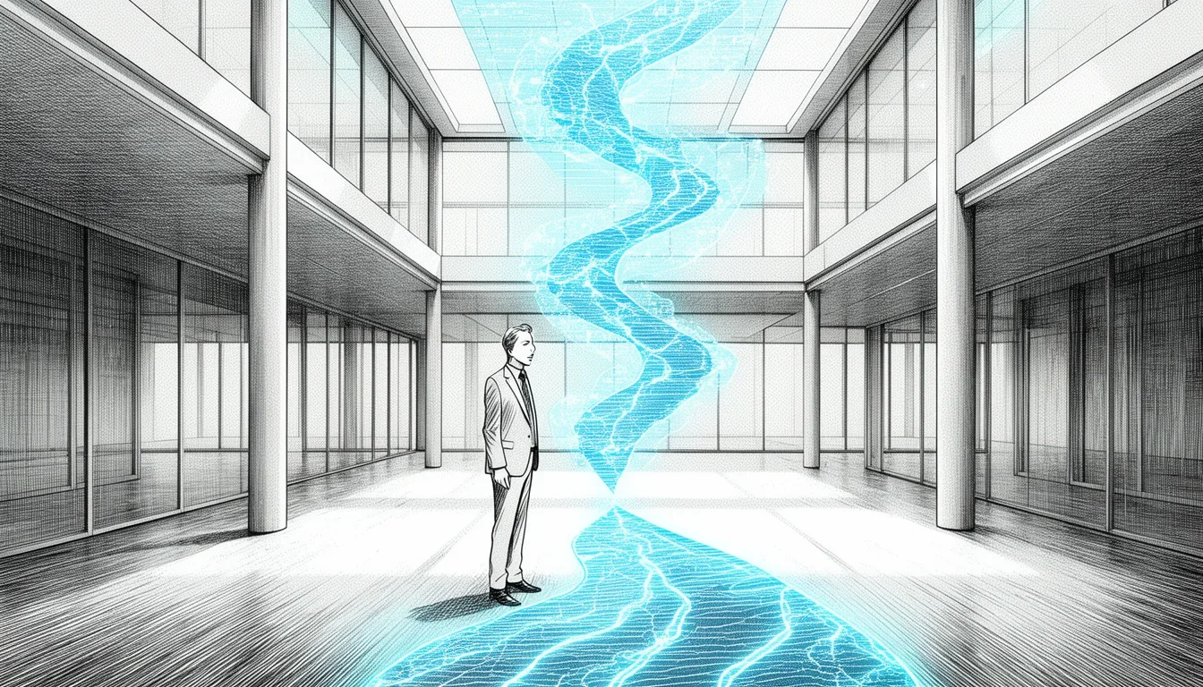
Most companies build their products for the “perfect” user who logs in every day, buys immediately, and never complains. That user rarely exists. The reality is a messy, fragmented path where people get confused, abandon carts, or decide your service is too slow before they even know they have a problem. Using user journeys to map optimal customer experiences isn’t just a buzzword exercise; it is the only reliable way to find those hidden friction points that are silently killing your revenue.
I have seen too many teams pour massive budgets into feature development while ignoring the fact that their current navigation is a labyrinth. They chase vanity metrics like “page views” while their actual conversion rate flatlines because the path from awareness to purchase is broken. A user journey is not a linear flowchart drawn by a marketing manager in Excel. It is a living, breathing record of how a real person thinks, feels, and struggles as they try to achieve a goal on your platform.
When we talk about mapping optimal customer experiences, we are talking about identifying where the user gets stuck and then redesigning the path to make it effortless. It requires looking past the aggregate data that says “10% conversion” and diving into the story of the specific person who entered, got confused by a confusing dropdown menu, and left.
Do not confuse a process map with a user journey. A process map tracks what should happen; a user journey tracks what actually happens, including the emotional highs and lows of the person navigating it.
If you want to stop guessing why users are leaving, you need to start mapping these journeys with the intent of fixing the specific moments of frustration, not just adding more buttons.
The Trap of Linear Thinking and Why Your Maps Fail
The biggest mistake organizations make when starting this work is treating the user journey as a straight line from point A to point Z. In marketing textbooks, you see diagrams that look like this: User sees ad -> User clicks link -> User lands on page -> User fills form -> User buys product. It looks clean. It looks logical. It is entirely wrong.
Real life is recursive. Users bounce back and forth. They check emails while filling out a form. They read a review after adding an item to the cart. They might visit your site three times over a month before they decide to buy. If your map assumes linearity, you will miss the loops where the real decision-making happens.
Consider the experience of someone buying a high-value item, like business software. They don’t just buy it; they research it, talk to colleagues, check compatibility, and worry about implementation. If your journey map stops at the “click” event, you are ignoring the pre-purchase anxiety that dictates whether they buy at all. You are mapping the transaction, not the experience.
Another common failure mode is the “single persona” fallacy. Teams often build one journey for “The Buyer.” But “The Buyer” is actually three different people: the one who feels the pain, the one who shops for the solution, and the one who signs the check. These three people have different goals, different fears, and different technical skills. Mapping a single journey for all of them results in a vague map that tells you nothing useful about anyone.
To get value from using user journeys to map optimal customer experiences, you must embrace non-linearity and segment by role, not just by stage. You need to map the journey of the skeptical analyst separately from the eager decision-maker. Only then will you see the specific frictions each role encounters.
Stop trying to map every possible variation of a journey at once. Start with your top two exit points and map the journey backwards from there to find the root cause of the drop-off.
This approach forces you to confront the data you actually care about: why people are leaving, not how they theoretically should arrive.
Distinguishing Touchpoints from Moments of Truth
There is a critical difference between a touchpoint and a moment of truth, and confusing them leads to wasted resources. A touchpoint is any interaction a user has with your brand. It could be an email notification, a search result, a pop-up, or a physical store visit. You can have thousands of touchpoints in a single journey.
A moment of truth is specific. It is the precise instant where the user’s perception of your brand shifts. It is where trust is gained or lost. It is where the decision to stay or leave is made. In a digital context, a moment of truth often coincides with a critical action: clicking “buy,” seeing an error message, waiting for a loading bar, or receiving a support response.
Many teams obsess over optimizing touchpoints that are merely decorative. They spend weeks tweaking the color of the “Contact Us” button or rewriting the copy on the footer. These are touchpoints, yes, but they are rarely moments of truth. The moment of truth is what happens when the user actually tries to click that button. Does the form load? Is the email address accepted? Is the response time under five seconds?
When you are using user journeys to map optimal customer experiences, you must filter your list of touchpoints to find the moments of truth. Ask yourself: “At this specific interaction, is the user making a judgment call?” If the answer is no, it might not be worth the immediate investment of time to optimize it, unless it feeds into a major decision point.
For example, in an e-commerce setting, the product page is full of touchpoints: images, descriptions, reviews, related items, trust badges. But the moment of truth is the “Add to Cart” click. If the user hesitates there, it isn’t because the font color was wrong; it is likely because the shipping cost was hidden or the return policy was unclear. Optimizing the font color won’t fix the hesitation. Optimizing the clarity of the total cost will.
Focus your optimization budget on the moments of truth, not the decorative touchpoints. A smooth moment of truth converts a hesitant user; a pretty touchpoint does nothing for conversion.
By distinguishing these two, you stop chasing shiny objects and start fixing the actual blockers in the user’s path.
The Emotional Arc: Ignoring Feelings Destroys Data Value
Traditional journey maps are often just data visualizations. They show steps, metrics, and funnels. They show “Step 1: 100%” and “Step 2: 80%.” This is useless for understanding the why. To truly map optimal customer experiences, you must map the emotional arc alongside the behavioral path.
Users have feelings. They feel excitement when they find a product they love. They feel confusion when a menu is unclear. They feel anxiety when a form asks for too much personal information. They feel relief when a problem is solved quickly. These emotions drive behavior more than logic does. If a user feels overwhelmed, they will abandon the task, regardless of how efficient your backend systems are.
Mapping the emotional arc requires qualitative data. You cannot get this from analytics alone. You need to talk to users. You need to read support tickets. You need to watch session recordings. Look for the signs of frustration: rage clicks, repeated form submissions, rapid scrolling, or simply leaving the page. These are behavioral manifestations of negative emotions.
Consider a subscription service. The journey map shows a high drop-off rate at the billing update step. The data says 60% of users cancel here. If you look only at the numbers, you might assume the price is too high. But if you map the emotional arc, you might discover that the billing update process is confusing and makes users feel targeted or scammed. The emotion is fear of loss. The fix isn’t a price cut; it’s a clearer explanation of why the charge happened and how it benefits them.
This emotional layer transforms the journey from a static report into a strategic tool. It allows you to empathize with the user. It helps you understand that a “bug” might feel like a betrayal, and a “slow load time” feels like disrespect.
When building your map, add a column for “Emotion” or “Sentiment” next to every stage. Rate it from Delighted to Frustrated. This visual representation makes it obvious where the experience breaks. You might see a long period of delight followed by a sudden dip at a specific handoff to customer service. That dip is your priority. Fixing the emotional dip often solves the behavioral drop-off.
The behavioral data tells you what users did. The emotional data tells you why they did it. You need both to understand the full journey.
Without the emotional arc, you are just treating symptoms. With it, you are addressing the root cause of the user’s dissatisfaction.
Operationalizing the Map: From Insight to Action
Creating a beautiful map is easy. Acting on it is hard. The biggest risk in using user journeys to map optimal customer experiences is that they sit on a shelf in a presentation deck, gathering digital dust. To make them useful, you must operationalize them. This means integrating the map into your daily workflow and decision-making processes.
First, assign ownership. Every stage of the journey, and every moment of truth within it, must have an owner. This person could be a product manager, a support lead, or a developer. When a user gets stuck at the “Checkout” stage, who owns that experience? If no one owns it, no one will fix it. If the owner knows that frustration spikes there, they will prioritize it.
Second, link the map to your sprint planning. Use the insights from your journey map to define user stories. Instead of saying “Improve checkout,” say “Reduce the number of fields in the checkout form to reduce user anxiety.” This connects the high-level journey insight to the concrete task in your development backlog.
Third, establish a rhythm for updating the map. User behavior changes. New features are added. Competitors launch new tools. Your map becomes stale quickly. Treat it as a living document that is reviewed quarterly or even monthly, depending on how fast your product cycle is. If the map doesn’t reflect reality, it is a fiction, and acting on fiction is dangerous.
Fourth, use the map to measure progress. Define success not just by revenue, but by journey metrics. Did the emotional arc improve? Did the drop-off at the specific friction point decrease? If you fix a known pain point and the numbers don’t move, you need to re-evaluate your hypothesis. Maybe the friction wasn’t the issue; maybe the price was.
Do not let the journey map become a static artifact. Treat it as a living document that must be updated as soon as you release a new feature or change a process.
This operational discipline ensures that the map drives action rather than just serving as a portfolio piece for the design team.
Common Pitfalls in Journey Mapping and How to Avoid Them
Even with the best intentions, teams often fall into traps that render their journey maps useless. Here are the most common pitfalls and how to sidestep them.
The Assumption Trap
Teams often assume they know what the user is thinking. They fill in the gaps with their own biases. “The user is looking for the buy button, so they must click it.” This ignores the possibility that the user is looking for a discount code or comparing prices on a competitor’s site. Always validate assumptions with real data. If you don’t know what a user is thinking, ask them. Use surveys, interviews, or usability testing. Never guess the internal monologue of your customer.
The Silo Trap
Journey maps often get created by a single department, usually Product or Marketing. But the journey crosses silos. The user might start with Marketing, move to Sales, then to Support, and finally to the Product team. If each silo creates its own version of the journey, you get a fragmented view. The map must be collaborative. Include representatives from Sales, Support, Product, and Engineering in the mapping session. Only then will you see the handoffs and the gaps between departments.
The “Happy Path” Trap
As mentioned earlier, focusing only on the happy path is a mistake. But it also happens in reverse: focusing only on the failure path. A good map balances both. You need to understand how the user succeeds to replicate it, but you also need to understand how they fail to prevent it. Ignore the errors, and you will keep making them. Ignore the successes, and you will stop learning what works.
The Data Paralysis Trap
Some teams get stuck trying to get 100% data coverage before they start mapping. They wait for analytics to tell them everything. While data is essential, it is not sufficient. You need qualitative context to interpret the data. Do not wait for perfection. Start with the data you have, fill in the gaps with user interviews, and iterate. A rough map based on real data is better than a perfect map based on assumptions.
The One-Size-Fits-All Trap
Finally, avoid the urge to create one master journey for everyone. As noted in the linear thinking section, different users have different paths. Create separate maps for key segments. You might have a “First-Time Buyer” journey, a “Lapsed User Reactivation” journey, and a “Enterprise Onboarding” journey. Each has unique frictions and opportunities.
Resist the urge to wait for perfect data before starting. A rough map based on interviews and partial analytics is infinitely more valuable than a perfect map based on guesses.
By avoiding these pitfalls, you ensure that your journey maps remain grounded in reality and useful for driving change.
Comparing Traditional vs. Empathy-Based Journey Maps
To clarify the shift in mindset required, here is a comparison of how traditional teams map journeys versus how empathy-based teams approach it.
| Feature | Traditional Approach | Empathy-Based Approach |
|---|---|---|
| Primary Focus | Efficiency and Funnel Conversion | Emotional Impact and User Goals |
| Data Source | Analytics and Web Logs | Analytics + Interviews + Observations |
| View of User | A statistical unit or data point | A person with fears, hopes, and context |
| Output | Funnel diagrams and heatmaps | Narrative stories with emotional arcs |
| Action Driver | “Increase conversion by X%” | “Remove the barrier causing frustration” |
| Team Involvement | Marketing or Analytics teams | Cross-functional (Product, Support, Eng, Sales) |
This table highlights that the shift is not just about adding more data; it is about changing the fundamental perspective of the user from a metric to a human being.
Integrating Voice of Customer into the Map
A journey map without the Voice of Customer (VoC) is just a guess dressed up in charts. VoC is the direct feedback from users, gathered through surveys, interviews, support tickets, and social media. Integrating VoC into your journey map is essential for accuracy.
When you map a journey, you are building a hypothesis: “We think the user feels X at step Y because of Z.” VoC provides the evidence to confirm or refute that hypothesis. For example, if your map suggests that users get frustrated at the login step, look at your support tickets. Do users complain about password resets? Do they ask for SSO? If the data supports your map, you have a strong case for fixing the login process.
You can create a “VoC Column” in your journey map. Next to each stage, list the common complaints or praise heard from users. This makes the map a repository of user sentiment, not just a flowchart. When you present the map to stakeholders, you can point to the “VoC Column” and say, “Here is exactly what users are saying about this stage.”
This integration also helps in prioritization. If multiple sources of VoC point to the same friction point, that is a high-priority issue. If the map says there is a problem, but VoC is silent, you need to investigate further. Maybe the problem is so subtle that users don’t articulate it, or maybe they are too frustrated to complain and just leave.
Treat Voice of Customer data as the ground truth. If your map contradicts what users are actually saying, trust the users until you can prove otherwise.
By weaving VoC into the fabric of your journey map, you ensure that the map reflects the real voice of your customers, not just the internal assumptions of your team.
Use this mistake-pattern table as a second pass:
| Common mistake | Better move |
|---|---|
| Treating Using User Journeys to Map Optimal Customer Experiences like a universal fix | Define the exact decision or workflow in the work that it should improve first. |
| Copying generic advice | Adjust the approach to your team, data quality, and operating constraints before you standardize it. |
| Chasing completeness too early | Ship one practical version, then expand after you see where Using User Journeys to Map Optimal Customer Experiences creates real lift. |
Conclusion
Using user journeys to map optimal customer experiences is not a one-time project; it is a continuous practice of observation, empathy, and improvement. It requires you to look beyond the numbers and see the people behind them. It demands that you challenge your assumptions, collaborate across silos, and prioritize the emotional reality of the user over your theoretical models.
The friction points you find will not always be obvious. Sometimes they are buried deep in a confusing form, sometimes they are the result of a slow loading time, and sometimes they are the feeling that your product doesn’t understand their needs. But when you identify them and address them, you do more than just increase conversion. You build trust. You create advocates. You transform a transaction into a relationship.
Start by mapping one critical journey. Find the moments of truth. Listen to the users. And then, act. The gap between where you are and where you want to be is filled with user experiences waiting to be understood and fixed.
FAQ
How long does it take to create a valid user journey map?
Creating a rough, actionable map can take as little as one day if you have a small team and focus on a single journey. However, a comprehensive map that covers multiple segments and includes emotional data usually takes a week or two of dedicated work. The key is to start imperfectly and iterate quickly rather than waiting for perfection.
Can user journey maps be used for physical products?
Absolutely. While digital journeys are easier to track with analytics, physical products have distinct touchpoints like in-store browsing, unboxing, shipping, and after-sales service. Mapping these journeys helps identify where customers drop off in the physical world, such as poor packaging or lack of clear instructions.
What tools are best for creating user journey maps?
There is no single “best” tool; it depends on your workflow. Simple tools like Miro or Mural are great for collaborative workshops. More advanced tools like Userpilot or FullStory integrate directly with your analytics and session data. The best tool is the one your team will actually use and update regularly.
How often should we update our journey maps?
Ideally, you should review and update your journey maps every quarter. However, if you are in a fast-paced product environment or after a major release, update them immediately. A stale map is worse than no map at all, as it can lead to decisions based on outdated assumptions.
Further Reading: Nielsen Norman Group on user journey mapping
Newsletter
Get practical updates worth opening.
Join the list for new posts, launch updates, and future newsletter issues without spam or daily noise.
Leave a Reply